After taking into consideration all of my different ideas I have created my Digipak! I have uploaded it for your enjoyment.


The reasons for my choices
- I choose the colour yellow as my background colour because it has connotations of happiness - the name of the band.
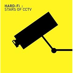
- It was also common in album covers of my chosen genre such as Hard-Fi - Stars of CCTV and New Young Pony Club - Ice Cream. <- This album cover also inspired me to use the little blue box on the front advertising what the album has to offer
- The font looks scribbled and hand drawn as it makes it appear more simple and personal
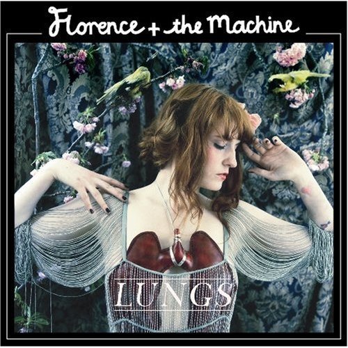
- Album covers I looked at which also used this technique were Florence and the Machine - Lungs and Larrikin Love - The Freedom Spark.
- The protagonist, our Claudia rabbit, is the main focus of the album cover as I thought it would create synergy between the album and the promotional video.
- Many album covers tend to have the band/artist on the front eg Meiko -Meiko and Regina Spektor - Begin to Hope. We don't have an actual band so I improvised and used the protagonist of our music video.
- I decided to have 12 track listings with slightly odd titles so 'Look At That Rabbit Go! wasn't incongruous.
- 12 tracks is common in a lot of albums within the alternative genre eg Maximo Park -Quicken the Heart and Kate Nash - Made of Bricks
- The film strip on the inside cover creates synergy between the promotional video and the album and the lipstick kiss was added because I though a plain yellow background looked a little boring.

0 comments:
Post a Comment